




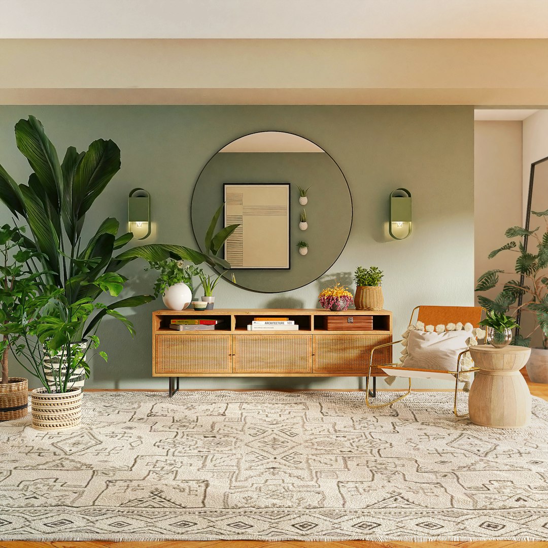
Roll Up Your Sleeves! The 2026 Color and Design Trends Your Home Has Been Waiting For
Your home, that cherished corner that tells your story and evolves with you, is about to experience an exciting transformation for 2026. If you’re someone who loves to get hands-on, this isn’t just a year to refresh your walls with a new coat of paint; it’s your perfect canvas to reinvent every nook, infuse it with your essence, and embrace design ideas that truly connect with how we live today!
The colors and trends emerging aren’t fleeting fads; they mirror how we’re changing, new technologies, and what we demand from the planet. They push us to create more conscious homes that embrace us and shout, ‘This is me!’
Lately, we’ve all rethought what “home” means to us, haven’t we? The pandemic immersed us in hybrid living, and suddenly, those four walls became an office, gym, school… and that’s when we realized how much we need spaces that serve multiple purposes, make us feel good, and bring us closer to nature. So, for 2026, all of that settles in. You’ll see color palettes that hug you and energize you at the same time, and designs that shout ‘Yes to sustainability!’, ‘Yes to customization!’, and ‘Yes to nature in full force!’. Here’s your complete guide to confidently transform your home with your own hands and a style that speaks volumes about you. Every brushstroke will be a declaration of intent!
The Colors of 2026: What’s Behind Them? (And How They Make You Feel)
Colors have incredible power; we often forget it, but they directly affect how we feel, whether we’re productive, or simply at ease! Choosing colors for your home in 2026 isn’t just about ‘looking pretty’; it’s about deciding what atmosphere you want to breathe, what story you want your walls to tell. After a few years of so much hustle and screen time, we all seek a bit of peace and, at the same time, that spark of energy that recharges us.
The 2026 color trends are the perfect answer to all of this. Say goodbye to cold grays and those ‘clinical’ whites we saw so much of before. Now, it’s all about warm, substantial tones that come from the earth! It’s as if we’re seeking a return to nature (that’s biophilia, if you want a technical name), creating our super cozy nest (Hygge style, sound familiar?), and, above all, shouting to the world ‘I’m unique!’ instead of having a catalog home. We no longer choose colors just because we like them, but for what they make us feel: Serenity? Optimism? A sense of home? A boost for creativity? And pay attention, sustainability is key. We lean towards colors that remind us of natural materials, of handmade items, something that won’t go out of style overnight. If you love DIY, understanding this ‘color psychology’ is golden. This way, you’ll not only choose what’s ‘in,’ but what will truly suit your home and you.

Paint Color Palettes That Will Define 2026
This 2026 is an invitation to dive into a world of color that celebrates depth, connection to the earth, and that calm we so desperately seek. Here are the palettes that will be the protagonists of your home, inside and out!
Paleta 1: Earthy Neutrals and Organic Tones
Imagine a warm embrace of nature in your own home. This palette is exactly that: pure calm and connection to the outdoors. It’s as if the usual neutrals went to the spa and returned with a richness and depth that only the earth can provide.
- What are they like? Forget cold grays or those ‘too perfect’ whites. Here, warm beiges, soft creams, vibrant terracottas, relaxing olive and sage greens, and deep earthy browns rule. These aren’t flat colors, oh no! They have a secret complexity, with nuances that change with every ray of sun.
- Your new favorites:
- “Warm Linen”: A beige with a golden touch, the perfect base for your home to breathe light and warmth at the same time! Great for large walls you want to feel spacious yet cozy.
- “Desert Breeze”: Think of that soft, not shouting, terracotta that reminds you of clay, adobe houses… ideal for adding a special touch to an accent wall, renovating that built-in bookshelf, or even giving your indoor pots a new look!
- “Deep Moss Green”: A dark green, with those gray or brown touches that transport you directly to an ancient forest. It looks spectacular in the dining room, a library, or to make your carpentry and window frames stand out like never before.
- “Oatmeal Cream”: An off-white with that subtle yellow or pink tint you won’t see anywhere else. It brings incredible softness to any corner and is the ideal canvas for your paintings or those natural wood furniture pieces you love so much.
- “Toasted Wood”: A deep brown, with lots of personality, perfect for creating breathtaking contrasts or highlighting those architectural elements of your home that deserve to be the center of attention.
- Why will you love it? Because it’s the answer to our need to feel ‘at home,’ to be comfortable, and to escape a bit from digital noise. It gives you well-being, relaxes your eyes, and invites you to disconnect. It’s the perfect backdrop for bringing nature indoors (biophilic design) and for anything handmade!
- Get started! Apply it to:
- Full walls: A sure hit for the living room, bedroom, or hallway! It will create a sense of harmony you’ll adore.
- Furniture: A dresser, a table, chairs? Give them a second chance with these colors and see how they come to life, with that sophisticated and natural touch that’s so in vogue.
- Details: Your picture frames, vases, baskets… or dare to create abstract murals with organic shapes! You’ll see what a difference it makes.
- Combine with: All types of wood (oak, walnut), natural fibers that invite touch (rattan, jute, linen), lovingly crafted ceramics, natural stone, and metals with history.
Paleta 2: Serene Blues and Greens
This palette is pure inspiration from nature in its calmest version: the sky, the immense sea, and that embracing vegetation. Its mission is to bring calm, clarity, and a sense of infinite space to your home!
- What are they like? Think of dusty blues, blues mixed with gray, sage greens, soft mints, and delicate turquoises. These colors evoke the serenity of a beach, the peace of a mountain lake, or the freshness of a meadow at dawn.
- Your new favorites:
- “Mist Blue”: A blue so soft, with a gray hint, that it will remind you of morning fog. Ideal for bedrooms or bathrooms if you’re looking for that spa atmosphere at home!
- “Tranquil Forest Green”: A green that’s neither too bright nor too dark, just right to connect you with the density and peace of a forest. Perfect for your study or living room!
- “Ocean Wave”: A light blue-green that will bring freshness and luminosity. Go ahead and use it in the kitchen or laundry room!
- “Deep Ocean Blue”: A subtle navy blue that will give you depth and elegance without overwhelming. It works great as an accent or on your library walls.
- Why will you love it? It connects directly with bringing nature into the home (biophilia) and helps you feel better. These colors are known to lower stress, improve concentration, and even help you sleep better! Ideal for creating your oasis of peace.
- Get started! Apply it to:
- Bedrooms and bathrooms: For relaxation and rejuvenation to be the protagonists!
- Home offices: Greens will help you concentrate, and blues will give you that much-needed calm.
- Meditation or reading nooks: Create your sanctuary of tranquility!
- Combine with: Pure whites, light woods, touches of chrome or silver, linen and cotton textures, and, of course, indoor plants!
Paleta 3: Rich Jewel Tones and Deep Accents
If drama, sophistication, and a visible personality are your thing, this palette is for you! It offers opulent and lively colors.
- What are they like? Emeralds that look real, intense sapphire blues, velveteen rubies, mysterious amethysts, and golden mustards. Be careful, these colors are not for painting everything; they are for accentuating! To create those focal points that scream luxury and bold style.
- Your new favorites:
- “Royal Emerald”: A jewel green that has it all. It’s perfect for an accent wall in the living room, for that bar cabinet, or for painting the interior of a bookshelf to make it the envy of everyone!
- “Velvet Ruby”: A dark, deep red, with brown touches, that will give warmth and drama to that reading corner or a door you want to highlight.
- “Midnight Sapphire”: A dark blue almost black, pure elegance and depth! Ideal for a master bedroom or to create that night sky effect on the ceiling.
- “Golden Ochre”: A mustard yellow with an earthy touch, which adds warmth and a vintage yet modern feel. It works wonders on cushions, artwork, or small furniture pieces!
- Why will you love it? It reflects that desire for something unique, tailor-made for you, and that understated luxury. With these colors, each space has its own story, far from generic. They are the icing on the cake for homes with a bohemian, renewed classic, or Art Deco touch!
- Get started! Apply it to:
- Accent walls: The easiest and most spectacular way to use these colors.
- Antique furniture: A dresser, a sideboard, an end table? Paint it in a jewel tone and you’ll turn it into the star piece.
- Cabinet or bookshelf interiors: An unexpected pop of color that adds depth and lots of style.
- Doors: Painting an interior door in a jewel tone is a daring and effective way to define a space!
- Combine with: Dark woods (walnut, ebony), velvet, brass and gold, breathtaking framed mirrors, and fabrics with botanical or geometric prints.
Paleta 4: Soft Pastels and Muted Brights
This palette is like a breath of fresh air and optimism, but with a maturity and sophistication that elevate them above childish pastels.
- What are they like? Dusty roses, pale yellows, caressing lavenders, faint mints, and delicate sky blues. These colors radiate a soft, playful energy, ideal for creating bright and cheerful environments without becoming tiresome.
- Your new favorites:
- “Rose Quartz”: A pink so pale and soft, it brings warmth and a sense of calm. Perfect for bedrooms or children’s spaces with a modern touch!
- “Dawn Yellow”: A yellow so subtle it almost looks like a warm white, but with the ability to brighten and lift the mood. Ideal for kitchens or breakfast areas!
- “Dreamy Lavender”: A very soft and dusty lilac, which can be surprising and sophisticated in a bathroom or that study where you let your creativity soar.
- “Refreshing Mint”: A muted mint green, which gives you freshness without being too “sweet.” Excellent for children’s rooms or laundry rooms!
- Why will you love it? It reflects that desire for lightness, optimism, and a kinder, drama-free approach to design. They are ideal for styles that mix vintage with contemporary, and for creating spaces that feel cheerful and open.
- Get started! Apply it to:
- Children’s rooms and playrooms: They provide that playful yet serene atmosphere that is so appealing.
- Creative workspaces: For inspiration and calm to flow!
- Vintage furniture: Repainting a vanity or an accent table in a soft pastel gives it that modern and chic touch that’s so in vogue.
- Decorative details: Paint subtle geometric patterns on walls or try gradient effects!
- Combine with: Pure whites, light woods (birch, maple), silver or copper metals, and textiles with minimalist or geometric prints.
Paleta 5: Timeless Whites and Off-Whites (with a special touch)
White is a classic that never goes out of style, but in 2026, its interpretation is much richer, inviting you to explore depth and texture.
- What are they like? This is an immersion into the richness of white; don’t see it as just a color, but as a canvas full of possibilities! It includes warm whites with subtle touches of cream or gray, cool whites with blue undertones, and whites that incorporate texture. The key is their versatility and ability to be the perfect backdrop.
- Your new favorites:
- “Toasted Almond”: A very warm off-white with a beige base, ideal for creating that cozy and bright atmosphere you’re looking for in any room!
- “Cotton Cloud”: A pure white with an almost imperceptible hint of gray, which will give you modernity and luminosity without the coldness of an absolute white.
- “Sea Pearl”: A white with a very subtle bluish nuance, perfect for bathrooms or kitchens where you seek that feeling of freshness and cleanliness!
- “Vanilla Cream”: An off-white with a clear soft yellow base, radiating warmth and elegance. Ideal for classic or rustic chic environments!
- Why will you love it? The timelessness of white meets a new appreciation for its nuances and textures. It is the perfect backdrop for your modern life, letting your furniture, art, and lighting be the true protagonists. Plus, it makes everything look more spacious and clean!
- Get started! Apply it to:
- Entire walls: The usual choice, but now paying attention to the shade of white you choose.
- Molding and ceilings: Highlight your home’s architecture with a white that matches your walls!
- Floor painting: Give a room a fresh and bright look by painting a wooden floor white or off-white.
- Texture effects: Try lime wash or microcement paints in white tones to add visual interest you’ll love.
- Combine with: Absolutely everything! It allows the richness of wood, metal, concrete, linen, and wool textures to shine. It is the perfect base color for any style.
Design Trends for 2026 (and How Your Brush Fits In)
The 2026 design trends echo our color palettes: we seek authenticity, well-being, sustainability, and that deep connection with nature and who we are. Paint is an incredibly powerful tool for you, the DIY enthusiast, to integrate these trends into your home!
1. Biophilic Design 2.0: Much More Than Just Plants
Biophilic design, which seeks to bring nature indoors to make us feel better, goes a step beyond simple potted plants. In 2026, it’s about fully immersing ourselves in imitating nature’s patterns, textures, and colors.
- What’s it about? It’s not just about adding plants; it’s about bringing elements that evoke nature in a deeper way. We’re talking about organic shapes, abundant natural light, sustainable materials, and, of course, colors that reflect plants, animals, and landscapes.
- How does paint come into play?
- Botanical or landscape murals: With your own hands, you can paint murals that simulate a forest, a starry sky, or a marine landscape, using those greens, blues, and earthy tones.
- Walls with natural texture: Use paints with lime wash, clay, or stucco effects in earth tones to recreate that feeling of adobe or stone walls.
- Painted organic patterns: With stencils or freehand, paint leaves, branches, or abstract rock formations on walls or furniture.
- ‘Painted’ windows: Create “false windows” with painted frames and drawn landscapes for spaces without views, or paint your window frames in a natural green to frame the real view.
2. Sustainable and Conscious Living
Concern for the planet and ethics directly translates into how we design our homes. And you, with DIY, have a key role in this!
- What’s it about? Prioritizing harmless materials, reducing waste, seeking durable items, and consuming consciously. We value restoring and reusing rather than buying new things.
- How does paint come into play?
- Eco-friendly paints: Choose paints with low or zero VOC (Volatile Organic Compounds) content, made with natural or recycled ingredients, and in sustainable packaging. Your conscious DIY starts by choosing responsible brands.
- Upcycling and repurposing: Paint is your magic wand to transform old furniture, flea market finds, or salvaged elements, giving them a second life with 2026 colors.
- DIY furniture with recycled materials: Build furniture with pallets, wooden crates, or old doors, and paint them with current trends to perfectly integrate them into your home.
- Timeless colors: Opt for those earthy neutral palettes or warm whites that are aesthetically long-lasting, so you won’t have to paint every so often to follow fleeting fads.
3. Multifunctional and Fluid Spaces
With remote work and modern life, our homes need to be chameleon-like, serving a thousand purposes.
- What’s it about? Spaces must be flexible, capable of transitioning from office to living room, from gym to guest room. The key is that everything flows visually.
- How does paint come into play?
- Color blocking: Use different colors (or shades of the same palette) to define zones in an open space (for example, a reading nook painted in a serene green within a beige living room).
- Painted acoustic walls: Paint acoustic panels or movable dividers in matching or contrasting colors, helping with functionality at the same time!
- Painted ceilings: Extend wall color onto the ceiling in a section to create a visual “box” that defines a work or relaxation area.
- Chalkboard or magnetic walls: Create functional surfaces with fashionable colors (like a deep green or a sapphire blue) that serve as note boards or customizable art galleries.
4. Textured and Patterned Surfaces
That appreciation for the handcrafted and organic extends to surfaces, which now seek to go beyond the perfect smooth finish.
- What’s it about? Textures that invite you to touch them, like stucco, microcement, lime wash, or those sand-infused paints. These surfaces add depth and unique character to your walls.
- How does paint come into play?
- Limewash paint effect: This DIY technique creates a soft, matte finish with color variations that evoke natural stone, perfect for the earthy palette!
- Stucco or concrete effect paint: Use specific paints or techniques to simulate the texture of stucco or concrete, ideal for an industrial chic or modern rustic style!
- Textured paints: Explore paints with sand, chips, or microspheres that add a tactile dimension to your walls.
- Faux Finishes: Although a bit more complex, with paint you can recreate effects of wood grain, marble, or patina for a touch of luxury and antiquity.
5. Personalization and Storytelling Homes
Your home in 2026 is a reflection of your life and passions, far from those “showroom” magazine spreads.
- What’s it about? Every object tells a story: inherited memories, your own artwork, travel collections, books, and photos. Design becomes an extension of who you are, not a copy of what’s fashionable.
- How does paint come into play?
- Backdrops for your collections: Paint a wall in a deep color (like a jewel tone) so that your cherished art, photo, or memory collection truly stands out.
- Custom murals: Create bespoke murals that represent a special place, a meaningful pattern, or your own artistic expression, using the 2026 color palette.
- Meaningful color blocking: Choose colors that have personal significance to you and combine them in unexpected ways for a design that is 100% yours.
- Renew historical furniture: Paint those inherited pieces or sentimental items with modern colors to integrate them into your new design, keeping their soul but updating their look.
6. Retro Revival with a Modern Twist
The 70s and 80s are back, but with a contemporary sensibility that makes them fresh and very current.
- What’s it about? Soft curves, warm colors, geometric and botanical prints, natural materials, and an overall atmosphere of optimism and simplicity. It’s not copy-pasting; it’s a sophisticated reinterpretation!
- How does paint come into play?
- Inspired palettes: Use earthy palettes, those soft jewel tones, or muted pastels to evoke that era, but with the saturation and nuances that are in style for 2026.
- Painted geometric patterns: Create bold geometric patterns on walls or furniture using contrasting but harmonizing colors from current trends.
- Arches and curved shapes: Paint arches or organic shapes on walls, or use color to highlight curved niches and alcoves.
- Color blocking on furniture: Paint vintage furniture with two or three colors that remind you of that retro aesthetic, but with a modern finish.
Practical Tips for Opening That Paint Can (and Nailing It!)
For you, who loves DIY, transforming a space with these new trends is a super gratifying project. But, beware, success lies in planning and executing with care.
1. Preparation is 90% of Success:
Before even thinking about opening a can of paint, the surface must be impeccable!
- Cleaning: Remove dust, dirt, and grease from walls with a gentle, degreasing cleaner.
- Repair: Fill holes, cracks, and smooth out any imperfections with spackle. Then, sand gently until it’s as smooth as the palm of your hand.
- Quality Painter’s Tape: Invest in good painter’s tape to protect moldings, ceilings, and window frames. A clean line is the key to a professional finish.
- Primer: Don’t skip it! Always use a primer, especially if you’re going from a dark color to a light one, if the wall is new (drywall), or if there are stubborn stains. Primer ensures the paint adheres better, the color is what you expect, and the finish is even. It will save you paint coats!
2. Color Samples: Your Best Friend:
Never choose a color just from a tiny sample in the store!
- Paint Large Samples: Buy small cans of the colors you like and paint large squares (at least 12×12 inches) on several walls of the room.
- Observe the Light: Natural and artificial light (warm or cool) greatly changes how a color looks. Look at your samples at different times of day and with the lighting you normally use.
- Test at Different Angles: A color doesn’t look the same on a sun-drenched wall as on a shaded one. Keep that in mind!
3. The Crucial Importance of Lighting:
Light is a factor that will define how you perceive color.
- Natural Light: North-facing rooms tend to have cooler light, which can make colors appear bluer. South-facing rooms receive warm, bright light, intensifying colors.
- Artificial Light: Warm (yellowish) bulbs enhance reds, oranges, and yellows, while cool (bluish) bulbs accentuate blues and greens. Think about what type of bulbs you use when choosing your palette.
4. Tools and Tricks for a Professional Finish:
- Quality Brushes and Rollers: Don’t be stingy here! Good tools make all the difference. A quality brush for details and a suitable roller for the type of paint and surface will make the finish spectacular.
- “Cutting-in” Technique: Learn to paint edges precisely with an angled brush, without needing tape, for perfect lines. Practice makes perfect!
- Thin, Even Coats: It’s always better to apply two or three thin coats of paint than one thick one. They dry faster and you avoid drips and roller marks.
- Special Textures: If you’re keen on lime wash, stucco, or textured paints, read the manufacturer’s instructions carefully and practice in a hidden area or on cardboard before tackling the main wall.
5. Think About How Your Home Flows:
- Visual Harmony: Imagine how colors connect from one room to another, especially in open spaces or hallways. They don’t have to be identical, but they should complement each other!
- Focal Points: Use accent colors to guide the eye through the house or to highlight those architectural elements you love so much.
6. Accent Walls vs. Entire Rooms:
- Accent: Ideal for incorporating jewel tones or bolder colors without overwhelming the space! Choose a wall that has something special (a window, a fireplace) or where you want to hang your artwork.
- Entire Rooms: Earthy neutrals, serene blues, or warm whites are perfect for painting an entire room, creating an enveloping and relaxing base.
7. Painting Furniture and Cabinets:
- Thorough Sanding and Cleaning: This is key for the paint to adhere well and last!
- Specific Primer: Use a primer suitable for the furniture material (wood, metal, laminate) to ensure optimal adhesion.
- Furniture Paint: Opt for acrylic paints or enamels designed for furniture, which offer greater durability and a resistant finish.
- Hardware: Consider changing handles or knobs to give it a super trendy final touch.
8. Your Safety First!
- Ventilation: Always work in well-ventilated areas to avoid inhaling fumes.
- Protection: Wear gloves, safety glasses, and old clothes. Cover the floor and furniture to protect them from splashes.
9. Don’t Be Afraid to Experiment!
At the end of the day, paint is just paint. If a color doesn’t convince you, you can always change it! DIY is a journey of learning and experimentation that allows you to express your creativity and personality like nothing else.
In Summary
2026 brings us a wave of renewal in interior design, where colors and trends unite to create homes that are not only beautiful but have a deep meaning! We’ve explored palettes that comfort you, like earthy neutrals, or connect you with nature, like serene blues and greens. We’ve also seen opulent jewel tones and optimistic soft pastels that celebrate your individuality and joy. And whites, always whites, reaffirm their power as a versatile canvas, reinventing themselves with nuances that enrich their presence.
These palettes don’t appear by magic; they are the result of larger design trends that center your well-being, sustainability, space flexibility, and, above all, your personal expression. Biophilic design 2.0 invites you to fully immerse yourself in nature, while conscious living pushes you to choose more ethically and durably. Multifunctional spaces reflect our adaptability, and tactile textures reconnect us with the handmade. At the heart of it all, personalization and a retro touch allow us to fill our homes with unique and authentic stories.
For you, who are passionate about DIY, this panorama is an open invitation to pick up the brush and transform. With the right practical tips, from meticulous surface preparation to the courage to experiment with textures and colors, every project becomes an opportunity to make your dreams come true. It’s the perfect time to create spaces that are not only up-to-date but resonate with your own spirit, offering you a sanctuary of beauty, calm, and authenticity. May your home in 2026 be a vibrant reflection of your inner world and the world you want to live in!